
Color palettes are the invisible glue that ties together the different decorative elements in a room, creating an aesthetic harmony that can delight the senses and stir emotions. Selecting the right colors is a decisive step in the design process, as it sets the mood, conveys a particular style, and eventually defines the entire space. The overall appeal and effectiveness of a room’s design significantly depend on the right blend and balance of colors.
High-end interior design is a field where artistry carefully meets functionality. When it comes to luxury spaces, the choice of colors is about much more than aesthetics. Colors bear a profound influence on how we perceive and respond to our environment. Subtle color selections can evoke feelings of relaxation, energy, serenity, or sophistication, determining the kind of ambience a high-end space requires. Thus, understanding and wisely using color palettes is an imperative to bring a high-end space to life effectively, making it not only luxurious but also conveniently livable.
Color Palettes
In the context of interior design, a color palette often consists of several complementary or contrasting colors that find expression in every detail of the space, from walls and furniture to accessories and lighting. In interior design, the primary objective of a color palette is to unify the design aspects by creating an aesthetically pleasing and visually balanced environment. A color palette serves as a roadmap for designing any space, allowing designers to plan and visualize the finished product effectively.
Basic Color Theory and Its Application to Interior Design
Color theory begins with the color wheel, which showcases primary, secondary, and tertiary colors. By studying the relationships between these colors, designers can create harmonious and eye-catching color schemes in spaces they design. For instance, analogous colors (those next to each other on the color wheel) offer a serene and comfortable design, while complementary colors (those opposite each other on the wheel) provide a vibrant, high-energy design. Incorporating these concepts can either soothe or stimulate the residents, depending on the desired ambiance.
How Color Affects Mood and Ambiance
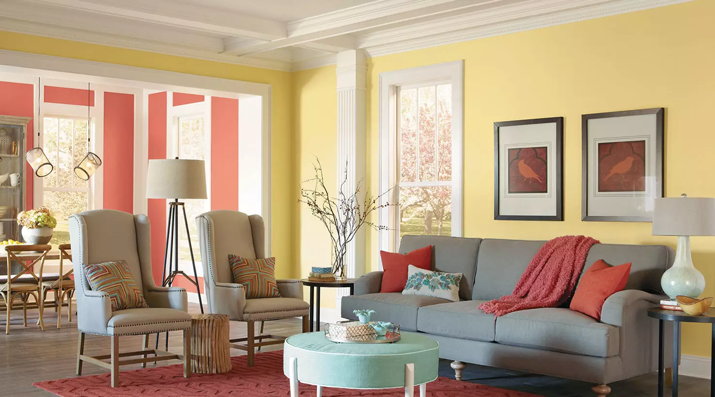
Color not only has a significant visual impact but also affects people’s emotions and behaviors. For example, blues and greens typically induce feelings of calm and relaxation, making them ideal for bedrooms or lounging areas. In contrast, warm tones like red and orange are stimulating and may be better suited for social spaces such as the living room or dining area. By understanding the psychological effects of color, designers can strategically use color palettes to influence the mood and ambiance of a space.
Popular Color Palettes in High-End Interior Design
Monochromatic Color Palette

The monochromatic color palette comprises different shades, tints, tones of a single base color, creating visual continuity and harmony. This palette is widely appreciated for its simplicity and elegance. In high-end interior design, monochromatic schemes are frequently used to create sophisticated and luxurious environments. For example, an all-white palette is often interpreted as lavish, creating an airy, peaceful, and clean environment. Conversely, an entirely black palette can initiate an opulent and dramatic space.
Analogous Color Palette
The analogous color palette represents colors adjacent to each other on the color wheel. This palette produces a richer visual experience while maintaining harmony in the design. Many upscale spaces apply this color scheme to add depth and dynamics while keeping the environment cohesive. A turquoise, powder blue, and navy palette, for instance, could bring the elements of a high-end beachfront villa into harmonious synchronization.
Contrasting Color Palette
Contrasting color palettes utilize colors that are opposite each other on the color wheel. This contrast creates a dynamic and vibrant look that is visually appealing. High-end design often leverages this palette to make prominent features stand out or to add a pop of color in an otherwise neutral space. A common example is a room with cobalt blue and gold accents, where the two contrasting colors create an effect of exquisite luxe.
Neutral Color Palette

Neutral color palettes primarily involve hues such as beige, ivory, taupe, black, gray, and white. Commonly perceived as elegant and understated, such palettes offer a classic touch to high-end interior design. Their flexibility allows them to be paired with other colors or used exclusively, catering to a minimalist design or a base for bold accents. For instance, a high-end penthouse might feature a palette of different gray shades, punctuated by metallic accents and rich textures to create a luxurious and modern space.
Tips for Choosing Color Palettes
Consider the Purpose of Each Room
The color palette for a home office may be very different from a bedroom, as you might want to stimulate productivity in one and promote restfulness in the other. Complementary to this, consider the amount and quality of natural light a space receives. Rooms with plenty of natural light can handle darker shades, which might make poorly lit rooms seem smaller and gloomier in contrast.
Seek Advice from Professionals
While keeping abreast with current design trends can ensure a fashionable and contemporary look, it’s vital to balance such trends with personal preferences to create a livable and loved space. Don’t hesitate to seek the advice of professionals. Interior designers bring a wealth of expertise and can provide customized suggestions specific to your home and personal taste. They can help you parse through the multitude of choices and cohesively tie a color palette to your intended emotion, theme, and functionality, crafting not only an exquisite but also a purposeful space.
The right balance and selection of color palettes determines the end product in high-end interior design, influencing the mood, cohesion, and aesthetic appeal of the space. Accessories like furniture, decor elements, and lighting fixtures can significantly enhance these color schemes and contribute to the final grandeur. With careful planning, knowledge of color theory, and strategic use of accessories, a designer can create a luxurious space that not only meets design trends but also reflects personal style and functionality.


")


")